- If you use white text, make sure there is a background color in the header and/or headerimg to showcase the white text again if for some reason the image does not appear on the screen or the user has "show images" turned off. This will allow your white text to still be visible.
- If the image has a main feature or element, position the text so it does not cover the main subject of the image.
- Make sure the color of the text is easily seen by your visitors and does not clash with the header art colors. Fluorescent orange text on a lime green background is painful.
- About the Header
- Have a purpose and point.
- A good header reflects the content of the site. The rest of the site has to meet expectations and live up to the header, so the header must reflect the content, purpose and intention of the site.
- It should invite visitors to remain.
- A good header is like the cover of a book or magazine. It should encourage people to stay and have a look around, read and look more, and find something of value. It is the teaser, the lead that grabs their attention and says "there is something worth exploring here."
- It should blend in with the overall look.
- Bold and dramatic headers lend themselves to boldly designed sites, whereas soft and pastel colored sites lend themselves to gentler graphic headers. A site dedicated to punk rock and grunge should have a header look punky and grungy. It is up to you, but think consistency.
- Headers do not need to have pictures.
- Not all headers must have pictures and graphics. Sometimes the words are more important, whether they are against a wash of color or a white background.
- Cluttered headers are still cluttered.
- Avoid cramming ads, navigation, text, scrolling news feeds, and the kitchen sink into your header. Simple is always better.
- The average header is less than 200 pixels high, but headers range in height from very thin to a half page. Remember that the main reason people visit your site is its content, and the more they have to scroll down past your header to get to the content, the less interested they tend to be. Help lead them to the content with your header.
- Think "Site Identity."
- A header is part of the site's identify or "brand" and people like to know they are on the same site when they click a link to another page within that site. Consider your header or header art as your site's "brand identity".
How to change your header in Blogger.
We will start with the easy method.
- Find your page elements from your layouts tabl.
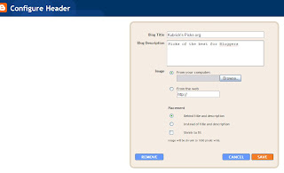
- Click on header
- Hit Edit

This is where you can upload an image, add or take away words, and add your Blog Description. The Blog Description will not always show up, but it's important for search engines.
Sometimes, your header element will be locked and will not let you add anything. No problem.
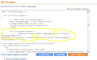
You'll need to go to the HTML link to change this.
Like every time you alter your html, be sure to download your template first.

Search for the following code ;
b:section class='header' id='header' maxwidgets='1'Now look for , probably just below.
b:widget id='Header1' locked='true'Change locked='true' to 'false'.
Save.
Go back to your elements page and try again.
Please note;
You widgets may or may not have had both of these going on. As long as in the end they look like my examples, you are fine.
Also, sometimes with templates not downloaded directly from Blogger, altering the header may not work because it will throw off the other elements. I would suggest that you contact the template designer for help. You can click at the link that they most likely left at the bottom of your template.


0 comments:
Post a Comment