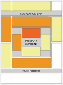
The best location for Google ads varies from page to page, depending on content. Here are a few questions to ask yourself when considering where to position your ads:
| |
 | Certain locations tend to be more successful than others. This "heat map" illustrates the ideal placing on a sample page layout. The colors fade from dark orange (strongest performance) to light yellow (weakest performance). All other things being equal, ads located above the fold tend to perform better than those below the fold. Ads placed near rich content and navigational aids usually do well because users are focused on those areas of a page. While this heat map is useful as a positioning guideline, we strongly recommend putting your users first when deciding on ad location. Think about their behavior on different pages, and what will be most useful and visible to them. You'll find that the most optimal ad position isn't always what you expect on certain pages. For example, on pages where users are typically focused on reading an article, ads placed directly below the end of the editorial content tend to perform very well. It's almost as if users finish reading and ask themselves, "What can I do next?" Precisely targeted ads can answer that question for them. Tip for forum webmasters and bloggers: Check out our specific tips on ad placement for forum sites and blogs. |


0 comments:
Post a Comment